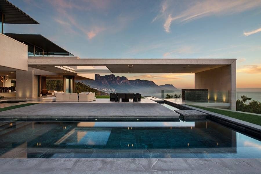
Cape Town-based architecture firm SAOTA, my favourite architectural team as I have already refered to recently here, gave special architectural lessons some months ago, by completed OVD 919, an incredible Cape Town modern mansion, positioned on the mountain ridge below Lion’s Head. Encapsulating the expansive 360-degree mountain and sea views, the architecture draws strength from the concrete finish used to create monumental forms which contrast to the copper roof. Limited to only two storeys above the ridge, the main living areas, pool terrace, and garden are below with the family bedrooms strategically positioned at the uppermost level for privacy. It’s really fantastic…!


Nestled below Lions Head this family home capitalises on spectacular views. The architecture draws strength from the concrete finish used to create monumental forms which contrast to the copper roof.


From the architect. Brief
The Brief was to create a spectacular home which encapsulated the expansive 360 degree mountain and sea views. Though views out were paramount this needed to be carefully balanced with the required privacy from within. The living areas were to be open plan – enhancing everyday life. “The architecture needed focus on creating a contemporary, uncluttered and sculptural building,” said Tamaryn Fourie, senior associate and project team member.

Site
The site is excellently positioned on the mountain ridge below Lions Head with views of Robben Island to the North and Camps Bay and the Twelve Apostles to the South.

Approach
Working with a relatively steep site and the fact that the Southern boundary is shared with a National Park, the design took on a sensitive approach.

The secondary spaces were positioned at the lower levels with care taken to limit excavation. From the road these levels are concealed by a large North facing landscape wall – its customised angular design achieves a natural result. Strategically positioned penetrations within the landscape wall permit natural light and ventilation to the rooms beyond but glazing is set back and thereby concealed.

“On arrival at a mid-level one is lured through the main garage with its double volume and graffiti walls towards the shaft of light and splash of landscaping emanating from the glazed Entrance Area beyond.

Sculptural timber clad stairs wrap themselves around a centrally positioned glass lift and take one to the upper levels of the house,” says Philip Olmesdahl, SAOTA director and project team member. The building is limited to only two storeys above the ridge. The main living areas, pool terrace and garden are below with the family bedrooms strategically positioned at the uppermost level for privacy.

The ‘layering’ of the house permits different experiences in difference spaces. From the main stairs the linearity of the customised cast bronze coffee bar leads one into the ‘heart of the home’ – the Kitchen.

The Kitchen in turn spills into the Dining Room and the Summer Lounge with its high ceiling of ribbed concrete.

The Winter Lounge is also adjacent to the Kitchen but this time the ceiling is lower – framing the view – which together with the centrally positioned fireplace creates an intimate space for more informal gatherings.

“Throughout this level boundaries are blurred and there’s a wonderful continuity between internal and external living – it’s a house for all seasons and plays off the mood of the climate and surrounding landscape,” said Tamaryn Fourie.

The large gallery type spaces emphasise the magnetism of the site and its ever present backdrop of the mountains and the sea.


A courtyard ‘cuts’ into main living areas – its waterfeature and delicate weathered Cor-Ten screen ensures a tranquil and sheltered space.

The base of the waterfeature is glazed to scoop refracted light into the main garage below. The ‘woven’ Cor-Ten screen playfully reflects light internally whilst also offering privacy to the bedroom level above.

“The aesthetic of the top two storeys – when viewed externally – is of monolithic white concrete beams. Their weight is accentuated as they seem to ‘float’ on light glazed facades,” says Joe Schützer-Weissmann. With limited walls and columns this house is all about the view – even glazing has reduced mullions wherever possible.


A ribbed pre-cast concrete soffit creates continuity between the living spaces with all services being carefully co-ordinated so as to disappear within recesses. All off-shutter concrete was cast using a customised white concrete mix. Once cured this was sandblasted to reveal a fine – carefully selected – aggregate resulting in a robust and unprecious look. The thin eaves of the zinc roof are also delicate in contrast to the massive beams below and appears to hover above the upper level.

The polished concrete floors of both the internal and external living areas ensure their seamless continuity. The timelessness of natural oak is celebrated and combined with feature brass insets for bedroom floors and all internal joinery.

The master bedroom which is on the uppermost level is set back from the boundary line to increase privacy from the mountain paths. “An expansive planter off the main bedroom reiterates the importance of the natural surroundings and their connection with the sea views beyond,” noted Philip Olmesdahl.

- Architects: SAOTA
- Location: Bantry Bay, Cape Town, South Africa
- Design Team: Philip Olmesdahl, Tamaryn Fourie & Joe Schützer-Weissmann
- Interior Decor: Studio Parkington
- Project Year: 2014
- Photographs: Adam Letch
source: http://www.archdaily.com/
Big Thanks !


No Comments